Video
See the Latest Features in Minitab Statistical Software ›
Minitab
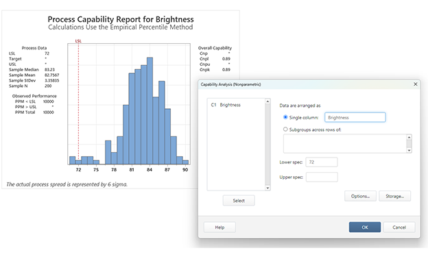
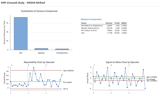
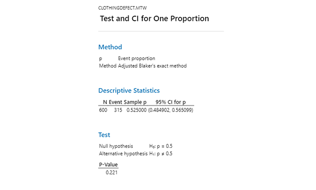
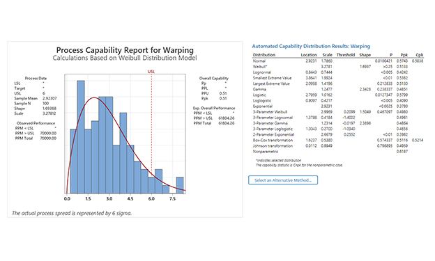
Expanded Statistical Features. Enhanced AI. Enriched Visualizations. The latest version of Minitab Statistical Software makes data analysis smarter, faster, and easier than ever.

You are now leaving minitab.com.
Click Continue to proceed to: